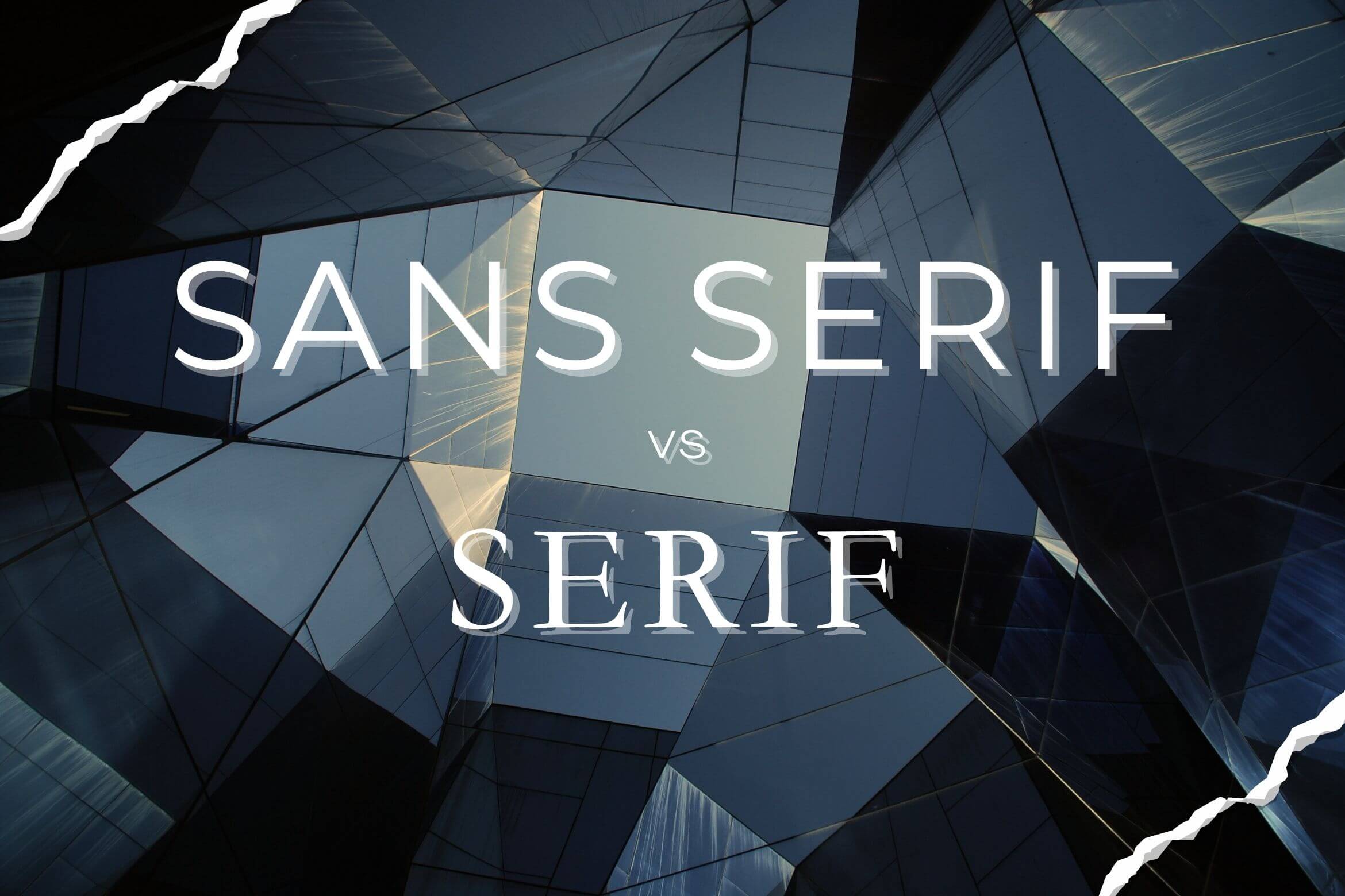
Serif vs. Sans Serif: This design dilemma keeps creatives up at night. These two fonts might seem like close cousins, but their function and impact are worlds apart.
Let’s explore these typographic titans’ subtle yet significant differences, from their basic distinctions to their ideal battlegrounds.
Serif
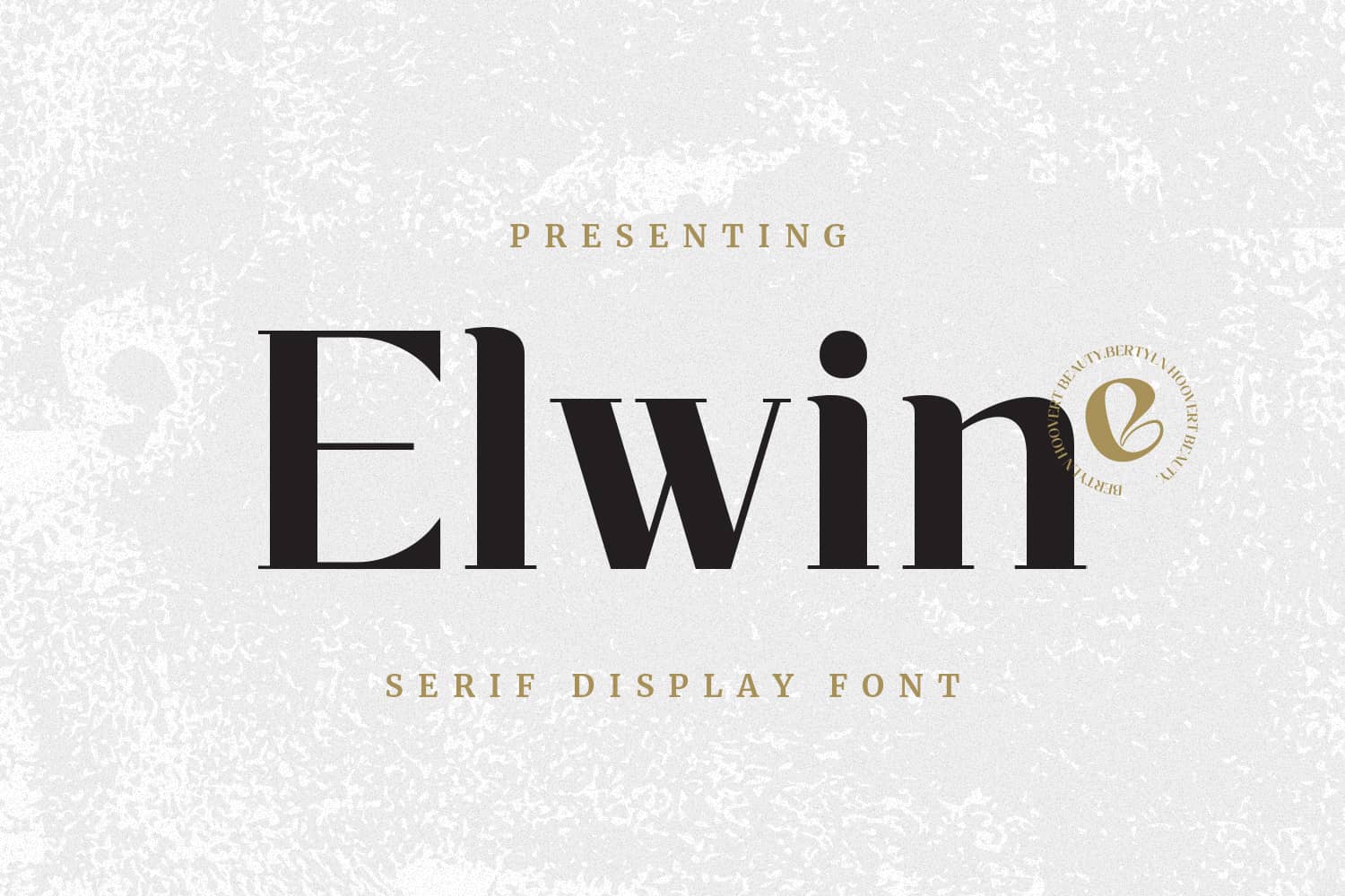
This font is like the wise elders of typography, carrying centuries of history in its elegant strokes. Its distinguishing characteristic is the tiny details on the tips of each letter, which give it a timeless and extravagant appearance.
Important information has been recorded using Serif font since the 4th century. The inscription at Trajan’s Column, a monument honoring Emperor Trajan’s victory in the Dacian Wars, is among history’s earliest and most widely recognized use of Serif type.
In the modern era, classic Serifs, like Times New Roman or Garamond, are often used in printed publications, such as books and newspapers. Meanwhile, the modern versions of it, like Mollen Fancyla, Gadhen, and Rengok, are often utilized for digital promotion materials, covers, logos, and invitations.
Recommended Use Scenario:
- Traditional Serifs are ideal for printed mediums.
- High-end or premium businesses who want to an air of maturity and exclusivity.
- Legal and scientific papers that attempt to express themselves in a formal and authoritative manner to gain user or consumer trust.
- Publication design that focuses on incorporating vintage-style lettering and type aesthetics.
Sans Serif

This font is identified by the absence of ornamental strokes normally present in Serif.
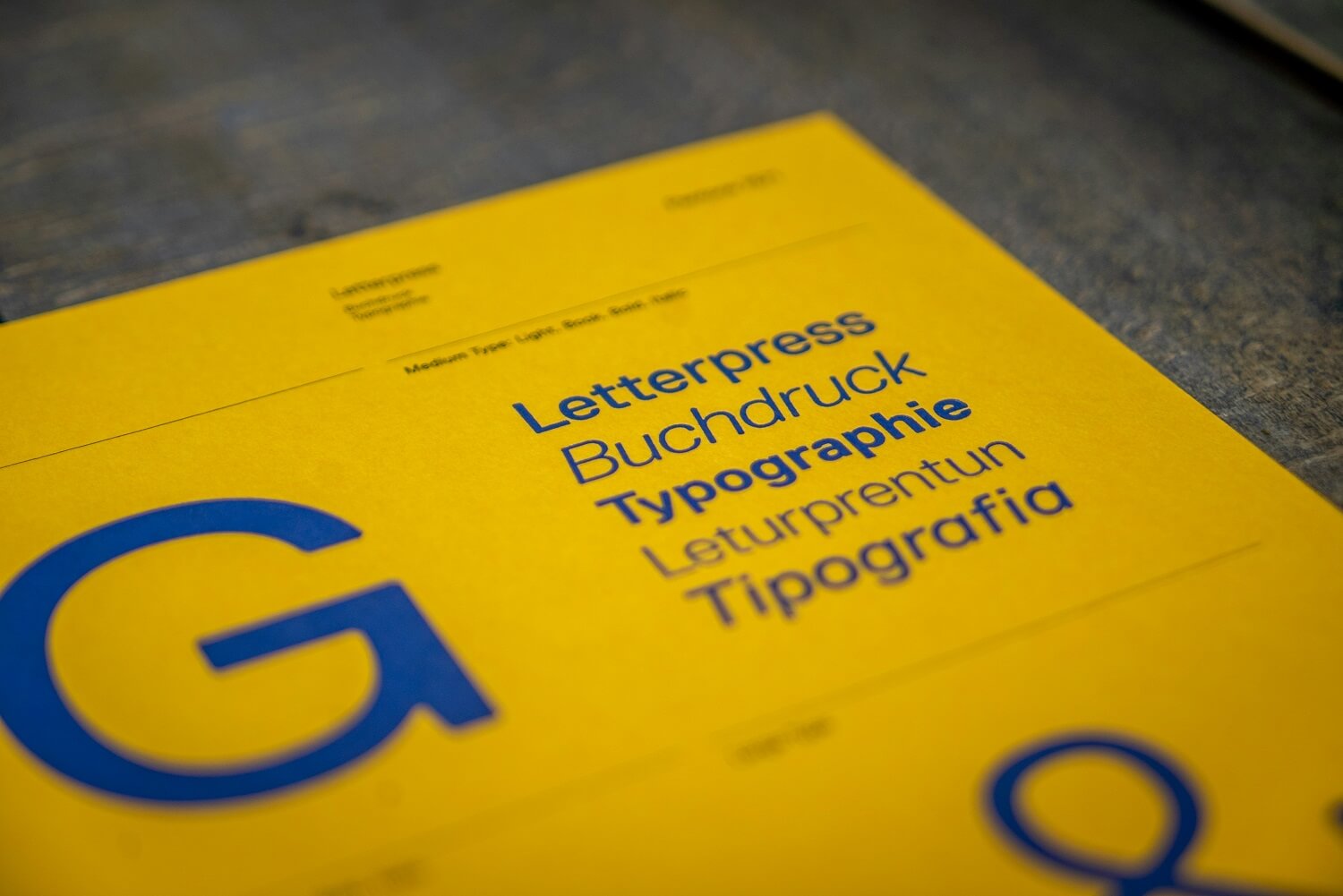
Historically, Sans-Serif rose to prominence in the 1830s, primarily in commercial printing, where their bold, striking appearance made them ideal for attention grabbing headlines.
As the years go by, this typeface is now more commonly seen across digital media. Glance at your phone. Scroll through your newsfeed. Chances are, the words you’re reading are dressed in the clean, modern lines of a Sans Serif.
This typeface has become the standard of the digital age, from the headlines on Google News to the pithy captions on your favorite social media platforms.
Of course, Sans Serif fonts are not just the old-fashioned ones you usually see, like Arial or Verdana. Sans Serif design has undergone many advancements. A list of Modern Sans Serif Fonts includes Bravo, Rich Taste, Rogalle and Roginds.
Recommended Use Scenario:
- For headings or lengthier text on blogs and mobile applications to boost screen readability.
- User Interfaces (UI): These typefaces are preferable for mobile applications, software interfaces, and dashboards, providing an enjoyable user interface.
- Creative digital ads and vibrant social media visuals.
Serif vs. Sans Serif Readability
Both typeface styles are suitable for long-form text and effective in delivering information. However, the debate continues about which one enhances readability the most. Research evaluating Times New Roman (a Serif) with Verdana (a Sans Serif) uncovered that Sans Serif fonts are considerably less difficult to read than Serif fonts, especially on digital devices.
This advantage arises from multiple aspects. First, Sans Serif provides larger, more visible letterforms on digital displays. Second, they have more evenly spaced letters, making them less cluttered and more enjoyable to read.
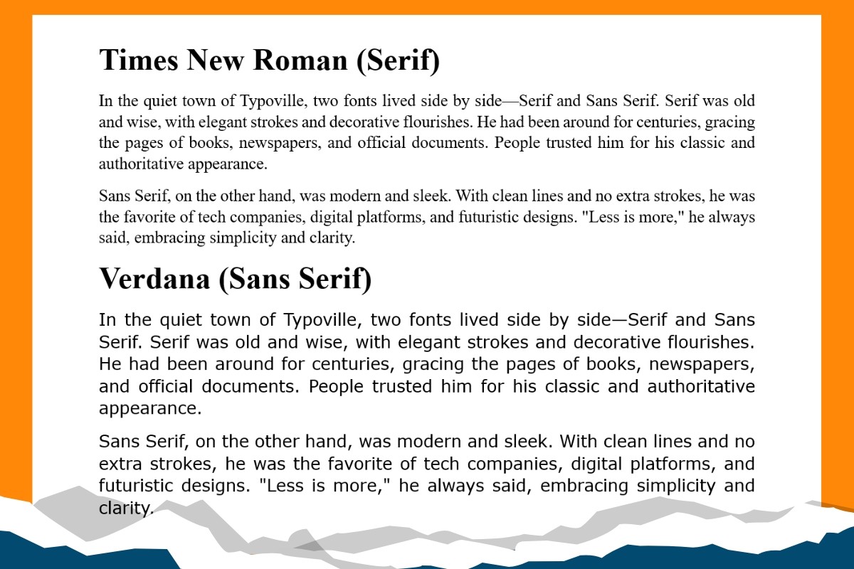
The image provided clearly compares how both typefaces are performed in extended text formats.
Which one do you think is the easiest to read? It has to be the bottom text, right?
Although both have distinct benefits, Sans Serif is often chosen for online reading due to its simplicity. Serifs, on the opposite, are ideal for printed content due to their classic style, which helps readability.
Key Differences
| Feature | Serif | Sans Serif |
| Appearance | Decorative Strokes | Clean and Minimalistic |
| Common Use | Printed Media | Digital Media |
| Readability | Easier for Printed Media | Better for Screens |
| Image | Traditional, Trustworthy | Modern, Clean, Approachable |
The easiest way to find the perfect typeface is to try out numerous possibilities and see which of them most suits your brand’s identity or goal. As well, it’s essential to consider the typefaces specific function, ensuring that it strengthens readability and suits the intent that you want to deliver.
Discover uniquely crafted typefaces at Imoodev, where style meets originality. Enjoy great deals on lifetime usage; no need to worry about Serif vs Sans Serif! Discover the best typeface for your needs and optimize your designs right away!