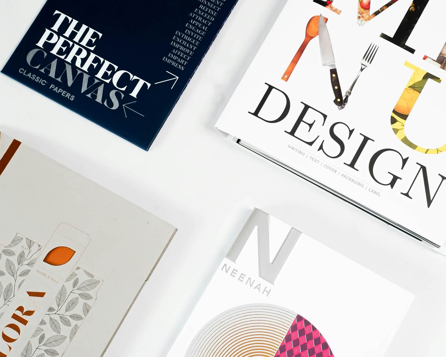
Typography can make or break your design, whether working on a website, logo, or even a social media post. The right font pairing can take your work from good to great, giving it that clean and professional feel. But here’s the tricky part: how to pair fonts just right?
Many designers find font pairing tricky because it’s not just about picking two fonts that look nice together, it’s about creating harmony, contrast, and a natural flow.
In this guide, we’ll explain the essentials of font pairing in a simple, no-fuss way so you can confidently mix and match fonts like a pro!
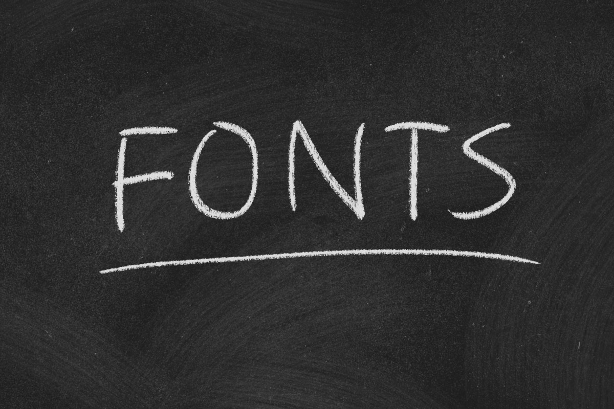
Understanding Font Categories
Before you start mixing and matching fonts, it helps to know their basic categories. Fonts generally have a few main types: Serif, Sans serif, Script, Display, and Monospace. Each type has its own vibe and works best in different situations.
Serif fonts think Times New Roman or Garamond have little decorative strokes at the ends of their letters, giving them a more classic and polished look. They’re perfect for books, newspapers, and anything that needs a professional touch.
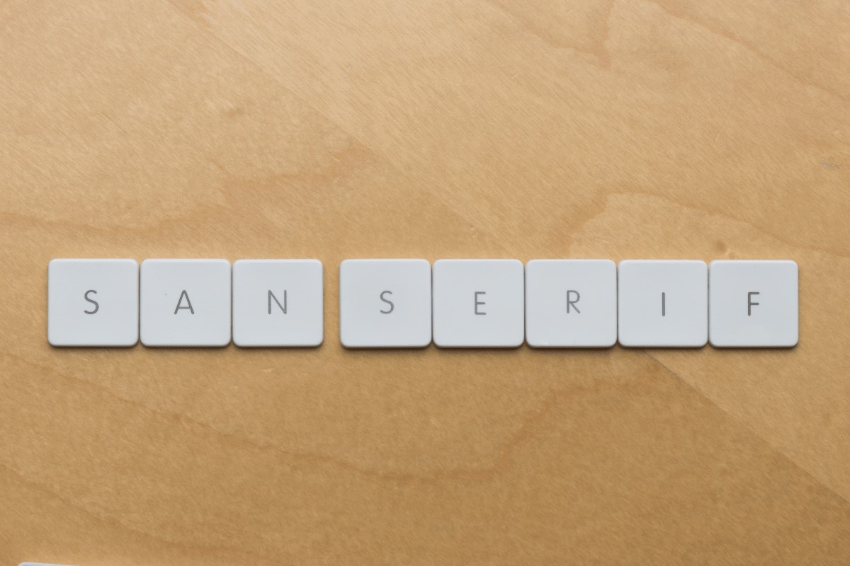
On the flip side, Sans serif fonts like Helvetica or Montserrat skip the extra strokes, making them look sleek, modern, and clean. That’s why you’ll often see them on websites, tech brands, and minimalist designs.
Next up are script and display fonts, these are the fun ones! Script fonts have a handwritten, personal vibe, and they’re great for adding a touch of elegance or creativity.
Display fonts, however, are bold and made to grab attention, so they work perfectly for headlines or logos. And let’s not forget monospace fonts, like Courier New, every letter takes up the same space, which is why they’re a go to for coding or that cool, old-school typewriter look.
The Golden Rule: Contrast and Harmony
It’s all about striking the right balance between contrast and cohesion when picking fonts that work well together. You want enough difference to make things visually interesting, but not so much that the fonts clash. The sweet spot is finding a pair that complements each other without fighting for attention.
A go to strategy is mixing a serif with a sans serif. This works because the serif brings a classic, polished vibe, while the Sans-serif keeps it fresh and modern. Take Playfair Display and Lato, for example; they create a stylish blend of elegance and simplicity that feels both timeless and contemporary.
Try mixing up font weights and styles within the same font family to add some variety. For instance, you could use Montserrat Bold for headings to make them stand out, while Montserrat Light keeps your body text looking clean and easy to read. This trick works exceptionally well in web design, where keeping things readable and well structured is key.
Avoiding Common Font Pairing Mistakes
Mixing and matching fonts can be fun to add personality to your design. However, it’s easy to go overboard and accidentally make things look messy. One common mistake is choosing almost identical fonts.
When the fonts are too similar, there’s no real contrast, and your design feels flat and uninteresting. A better approach is to mix fonts that have distinct differences in weight, style, or shape. If you’re unsure where to start, a font combination generator or font pairing generator can help guide you to the perfect matches.
Another mistake is using too many fonts. Less is more, so stick to two or three fonts at most. If you need more variety, experiment with different weights, sizes, or italics within the same font family instead of adding many different ones. Keeping things simple makes your design look cleaner and more polished.
Testing Your Font Pairings
After picking out your fonts, it’s important to see how they perform in different settings. Fonts can change their vibe depending on where they’re used, whether on a poster, a website, or an app. A good trick is to whip up a quick layout and see how the fonts work together.
If you’re aiming for the perfect font combo aesthetic, you need to find the right combination of fonts that complement each other. Testing out some Google font pairing can be a great starting point for ensuring your design feels balanced and cohesive.
Pay attention to spacing, line height, and color contrast. Some fonts might look perfect in black and white but could become hard to read if placed over a bright or busy background. If you’re working on something for the web or apps, it’s also smart to test your fonts on different screen sizes to ensure they stay sharp and easy to read.
Now that you’ve got a solid grasp on how to pair fonts like a pro, you might be curious about where to snag some top-notch fonts for your next design project.
If you’re on the hunt for some seriously cool fonts, you should definitely give Imoodev a look. We have a solid range of sleek, trendy, and unique fonts that are perfect for everything from business projects to creative designs.