Have you ever wondered why some designs work so well and are impactful, whereas others don’t and look flat?
The secret often lies in the font since it can impact the overall personality of your brand or project, readability, user experience, and even emotional perception. So, how to choose fonts and decide which one is the perfect one?
A Guide to Font Selection
Grab a notebook, sharpen your creative thinking, and dive into these key considerations for choosing the right font:
Identify The Purpose
What is the best way to choose a font? The first step is to determine where and how the typeface will be used. Choosing the correct typeface is context-dependent, as every project has unique requirements. For example, if the font is needed for a logo, headline, or title, it does not need to be very versatile. To stand out, consider utilizing a typeface that is both distinctive and attractive to the eye, such as Display or Decorative.
However, fonts must be more adaptable if used for other brand needs, such as additional captions, packaging information, slogans, or product descriptions. Like a standard Serif or Sans Serif, a font that will look nice across various sizes and platforms while remaining easy to read.
Define The Atmosphere
How do you choose fonts for your brand? The following phase is deciding on the vibe you want in the final product. Each typeface has a distinctive feature that affects the whole vibe of your design. Before you choose a font, evaluate whether you want to convey a serious, elegant, reliable, or fun and relaxed vibe.
For example, Serif fonts are advantageous for brands that want to create professionalism and elegant branding, as they convey an elegant and classy feel. Meanwhile, companies aiming for a fun and creative atmosphere could employ Sans Serif fonts, offering a more relaxed and trendy feel.
Identify the Setting
A font that appears excellent at bigger proportions could become weird and hard to read when scaled down. Conversely, a straightforward font typically used for body content may lose its punch when enlarged for bigger displays.
So, be certain you have thoroughly analyzed its intended purpose, whether for little or large visuals, to ensure clarity and effectiveness.
Determine the Needs: Print or Digital Media
It is vital to identify whether the font will be used exclusively for print or digital media, as not every font performs well in both formats. Some fonts have been designed to seem clear and appealing on digital devices, but they may lose clarity or appear less professional when printed on paper.
For example, fonts with small features or thin strokes may appear sharp on the computer’s screen but fade or become challenging to read when printed. Meanwhile, fonts that are too bold and thick, on the other hand, may be appropriate for high-quality printing but appear heavy and difficult to read on people’s smartphone or tablet screens.
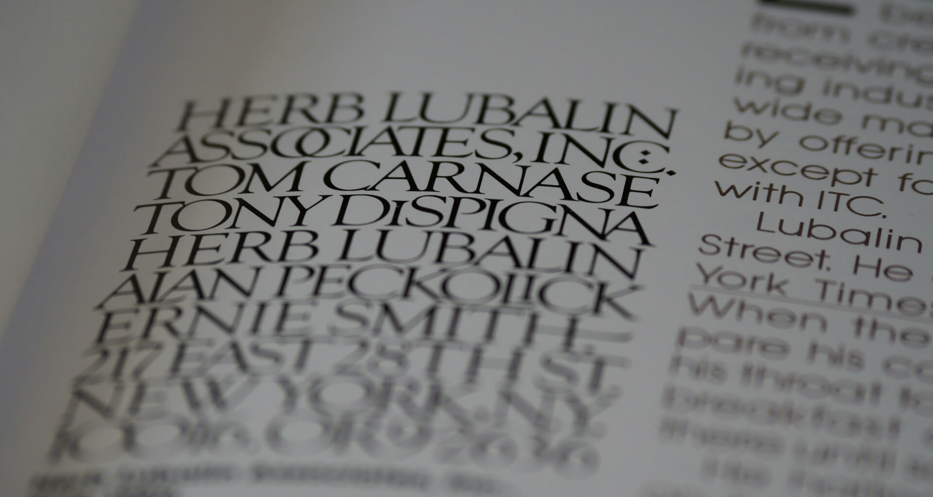
Pick Fonts Carefully, One at a Time
Combining numerous fonts in one design is extremely common. Nonetheless, ensure each typeface complements the others to preserve a clean and aesthetically acceptable design.
You may begin by picking the main font for your headline or title. Then, compare complementary fonts to the first font. If your primary font is bold and strong, balance it with a simpler font to avoid an overwhelming look.
Best Practices for Choosing Fonts for Different Uses
Fonts are fun, but a little strategy never hurts! Here are some things to think about when choosing the right one for the job.
- For Websites: How do you choose fonts for websites? Prioritize readability by choosing Sans Serif fonts for longer text.
- For Print: Pick fonts with good contrast and weight variations. Classic Serif fonts work well in books and magazines.
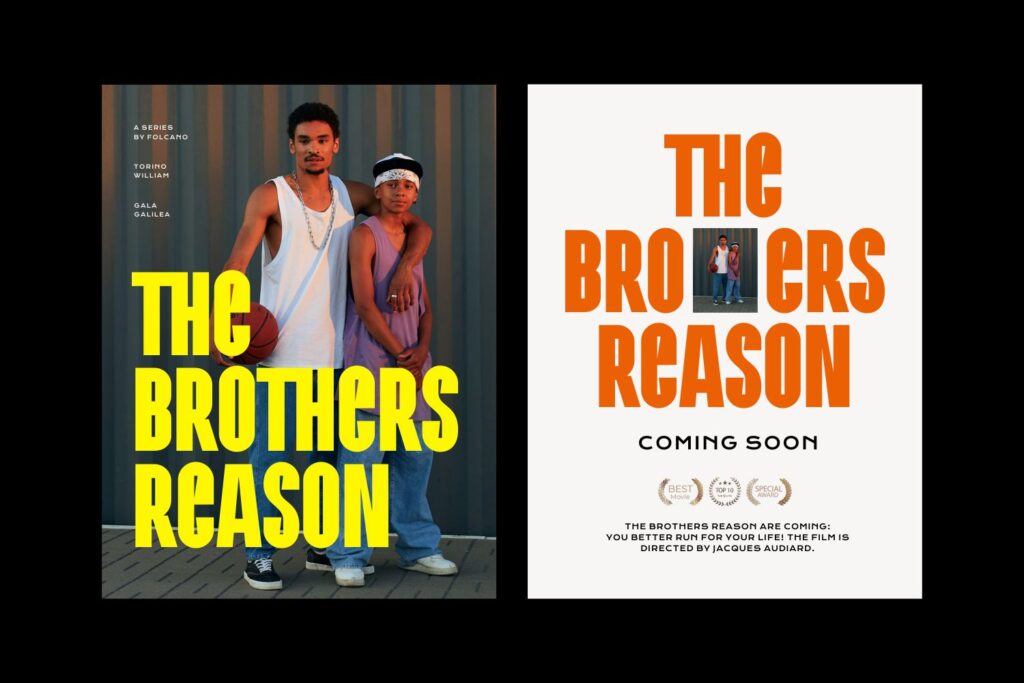
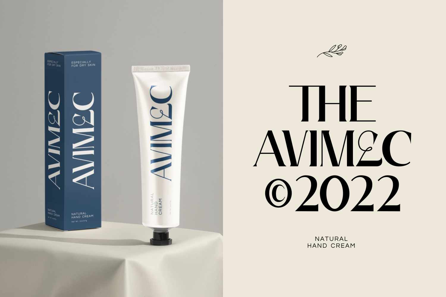
- For Branding and Logos: Look for a typeface that accurately reflects the character and persona of your brand.
- For Social Media and Marketing: Choose Sans Serif, Serif, Display, and Decorative typefaces, which are strong and easy on the eyes. However, ensure that the font is still readable.
Besides the factors mentioned earlier, it’s important not to overuse variation of fonts. Follow the 3-font rule!
What is the 3 font rule? This rule suggests using a maximum of three different fonts in a design. This approach helps keep the layout structured, professional, and visually appealing.
How do I find good fonts? Visit Imoodev to see a wide range of interesting fonts at affordable prices. With so many different styles available, from elegant to fun, Imoodev makes it easier to choose fonts that best suit your needs.