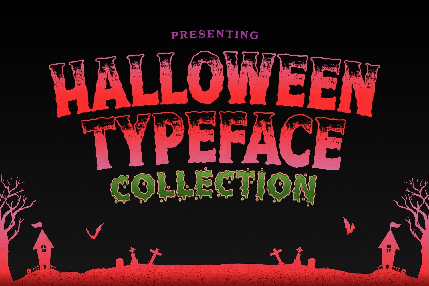
Visual identity dictates how audiences perceive seasonal branding. When autumn approaches, marketing campaigns, event fliers, merchandise lines, and digital content undergo a distinct thematic shift. Standard, clean typography fails to capture the thrilling, eerie atmosphere that the season demands. Achieving the right emotional impact requires specialized typography that can instantly communicate suspense, mystery, or playful horror. Designers need high quality typography assets that maintain a balance between creative thematic aesthetics and clear readability across various print or digital formats.
Why Typography Matters for Seasonal Horror Branding
Choosing specific typography for autumn projects involves understanding visual psychology. Humans naturally associate jagged lines, uneven brush strokes, dripping textures, and sharp angles with tension and unpredictability. Utilizing standard corporate lettering for a seasonal event reduces the visual impact and fails to engage target audiences effectively. High converting promotional banners and merchandise lines rely heavily on display titles that stand out immediately on social media feeds or retail shelves.
Integrating dedicated typography assets allows creators to establish immediate thematic context without relying solely on complex graphic illustrations. A well-chosen title element sets the correct expectations, whether the project aims for a terrifying slasher movie aesthetic or a lighthearted, family friendly autumn festival. Furthermore, using premium typography ensures that the vector lines remain clean when scaled to large print dimensions, protecting the overall professional quality of the commercial output.
13 Best Spooky Fonts for Halloween Designs
Selecting the right asset requires evaluating the specific mood of your project. Below is a curated list of fifteen premium display styles engineered to elevate seasonal branding, marketing assets, and product packaging.
1. The Power of Fear

This asset delivers a raw, aggressive horror aesthetic inspired by classic thriller cinema. The rough, distressed textures and uneven vertical lines give it a volatile, hand-drawn appearance. It performs exceptionally well on dark backgrounds for editorial layouts, large event posters, and apparel designs. Creators looking for maximum visual impact can utilize The Power of Fear to create striking title cards or bold merchandising headers.
2. Hallocute

Not every seasonal project requires intense gore or terrifying elements. This display option features rounded, thick, and bubbly character structures with subtle eerie twists, making it ideal for kid friendly packaging, school event fliers, and animated social media assets. For projects that require a cheerful yet seasonal vibe, the Hallocute provides a clean, highly readable layout that appeals directly to younger demographics.
3. Ghostown

Combining historical western aesthetics with an eerie, supernatural atmosphere, this choice offers elongated serifs and weathered textures. The structural stability of the letters makes it excellent for structured editorial headers, corporate seasonal promotions, and vintage badge designs. Designers aiming for a sophisticated, historical ghost story vibe can implement the Ghostown to establish a grounded, classic layout.
4. Hello Rownes

This variable style blends high-end editorial sophistication with sharp, unpredictable cuts along the terminal points of each letter. The contrast between elegant curves and dangerous, needle like serifs generates an underlying feeling of unease. Incorporating the Hello Rownes elevates luxury branding, fashion seasonal lookbooks, or minimalist book covers that require a subtle touch of mystery.
5. Mons Terial
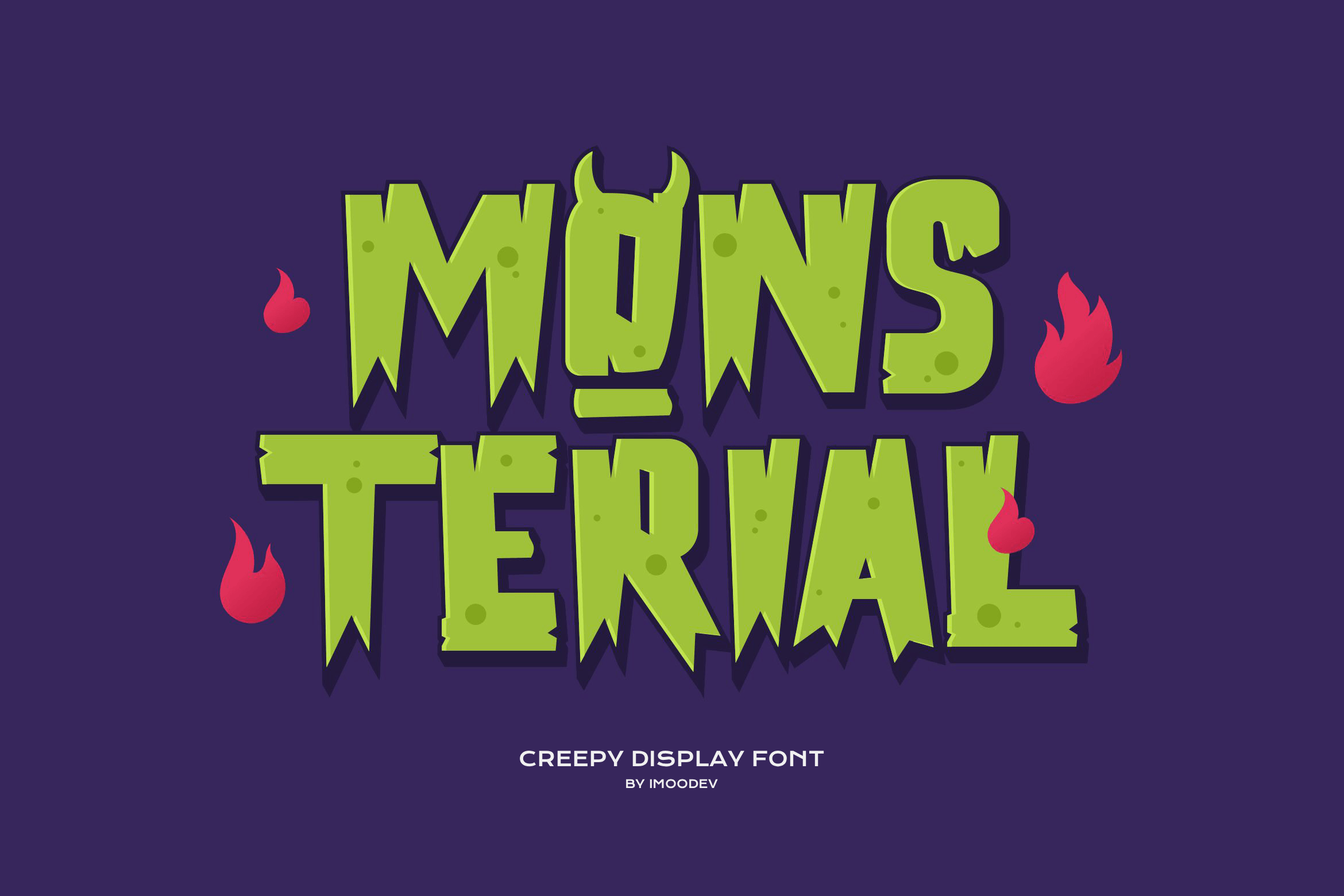
Boasting heavy, blocky proportions and a deeply textured surface, this asset mimics classic cinematic monster movies and sci-fi comic book titles. The wide stance of the characters ensures excellent visibility from a distance, making it perfect for roadside banners, physical event signage, and YouTube thumbnails. Utilize the Mons Terial whenever your layout demands an imposing, heavy structural presence.
6. Roar Guroes

Featuring fast, chaotic brush strokes and high kinetic energy, this option brings an organic, threatening feel to any layout. The visible bristle textures suggest urgency, mimic painted warnings, or resemble traditional slasher film typography. For intense sports branding, energetic music event fliers, or radical streetwear designs, integrating the Roar Guroes textured brush guarantees a dynamic, unforgettable visual presence.
7. Amerikan Folk
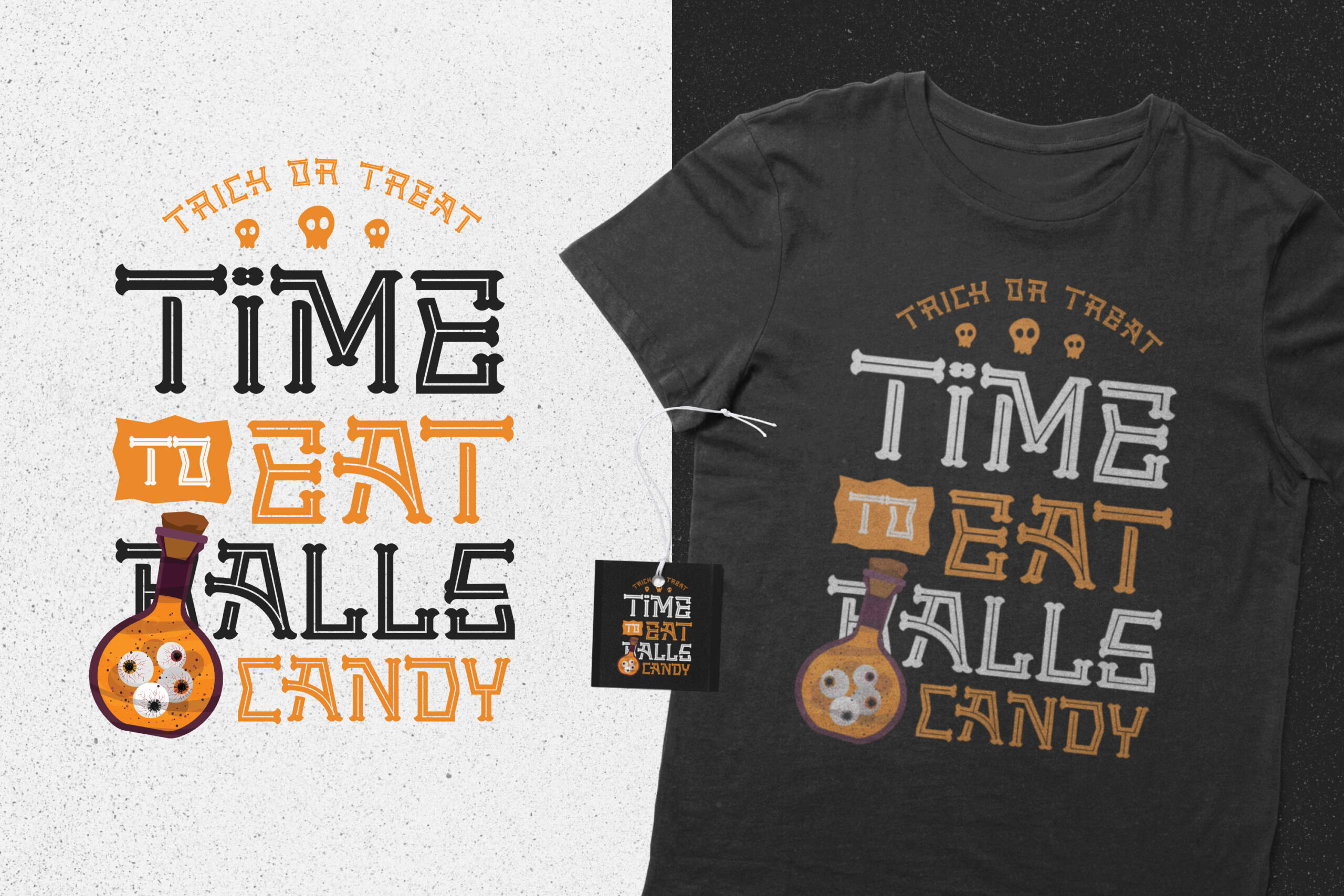
This option draws inspiration from rustic, weathered wood-block printing techniques common in traditional rural folklore. The solid geometric shapes combined with distressed interior cutouts offer an organic, historic appearance suited for artisanal product labels, cider packaging, and indie game titles. Incorporating the Amerikan Folk infuses a tactile, hand crafted charm into digital layouts.
8. Brown Dog
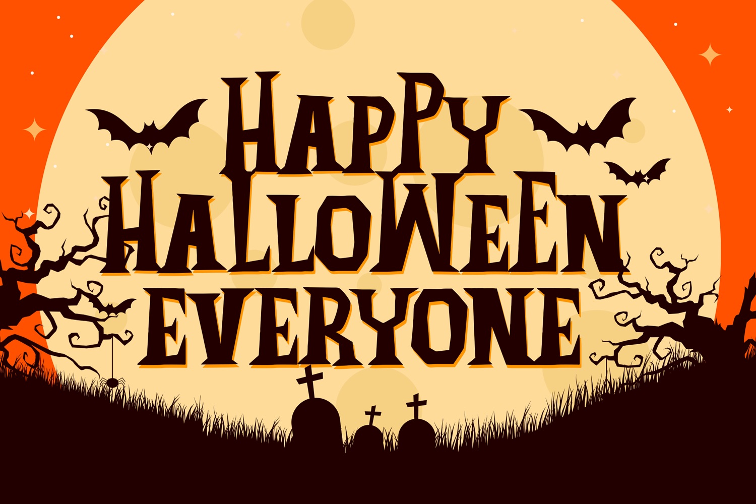
Presenting bold, condensed letterforms with an off kilter, cut out construction, this asset brings a modern, quirky style to seasonal designs. The blocky nature allows for creative color layering and works beautifully on stickers, enamel pins, and vibrant digital ad campaigns. Designers seeking a distinct contemporary aesthetic will find that the Brown Dog breaks away from traditional gothic cliches effortlessly.
9. Darkened Sinister
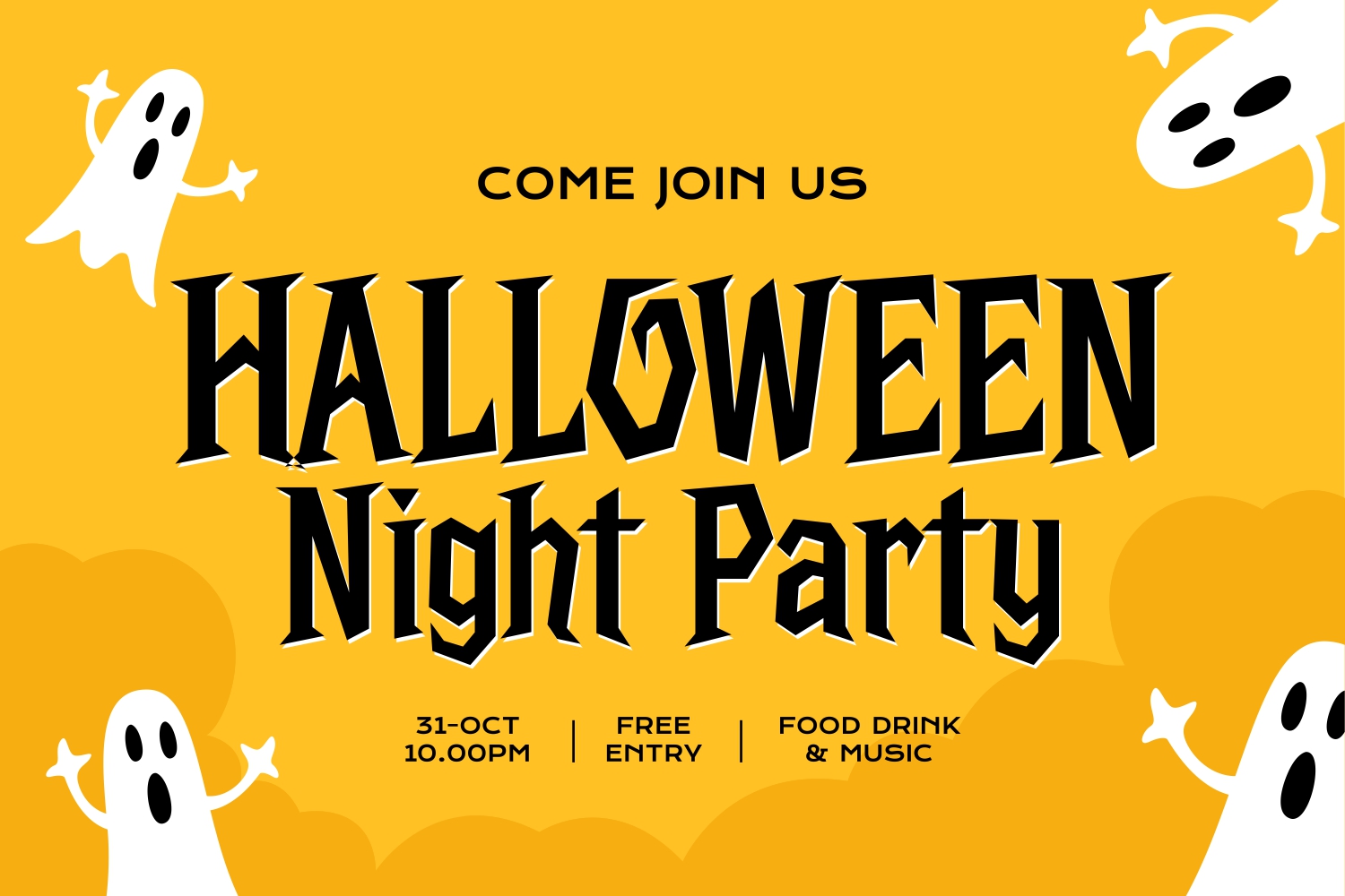
For projects requiring absolute historical authenticity, this asset offers a heavy blackletter structure updated for modern printing standards. The sharp, ornate calligraphic diamond shapes and thick vertical strokes evoke medieval manuscripts, gothic cathedrals, and classic dark fantasy themes. Implementing the Darkened Sinister provides an authentic, authoritative atmosphere for premium beverage labels or metal band merchandise.
10. Dietomb
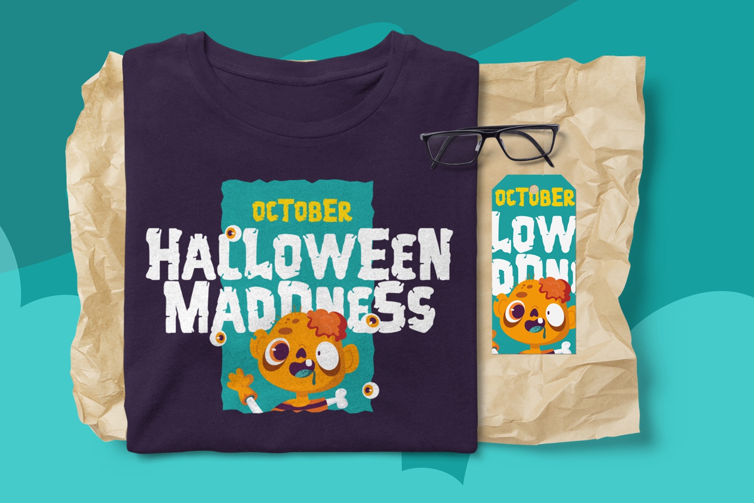
This style leans heavily into the underground death metal subculture, utilizing intricate, distressed line work that creates a highly textured appearance. While maintaining a strong artistic identity, it provides excellent decorative value for focal centerpieces, experimental album art, and statement streetwear. The Dietomb works perfectly when the typography itself functions as the primary illustrative element of the design.
11. Mokacinoy
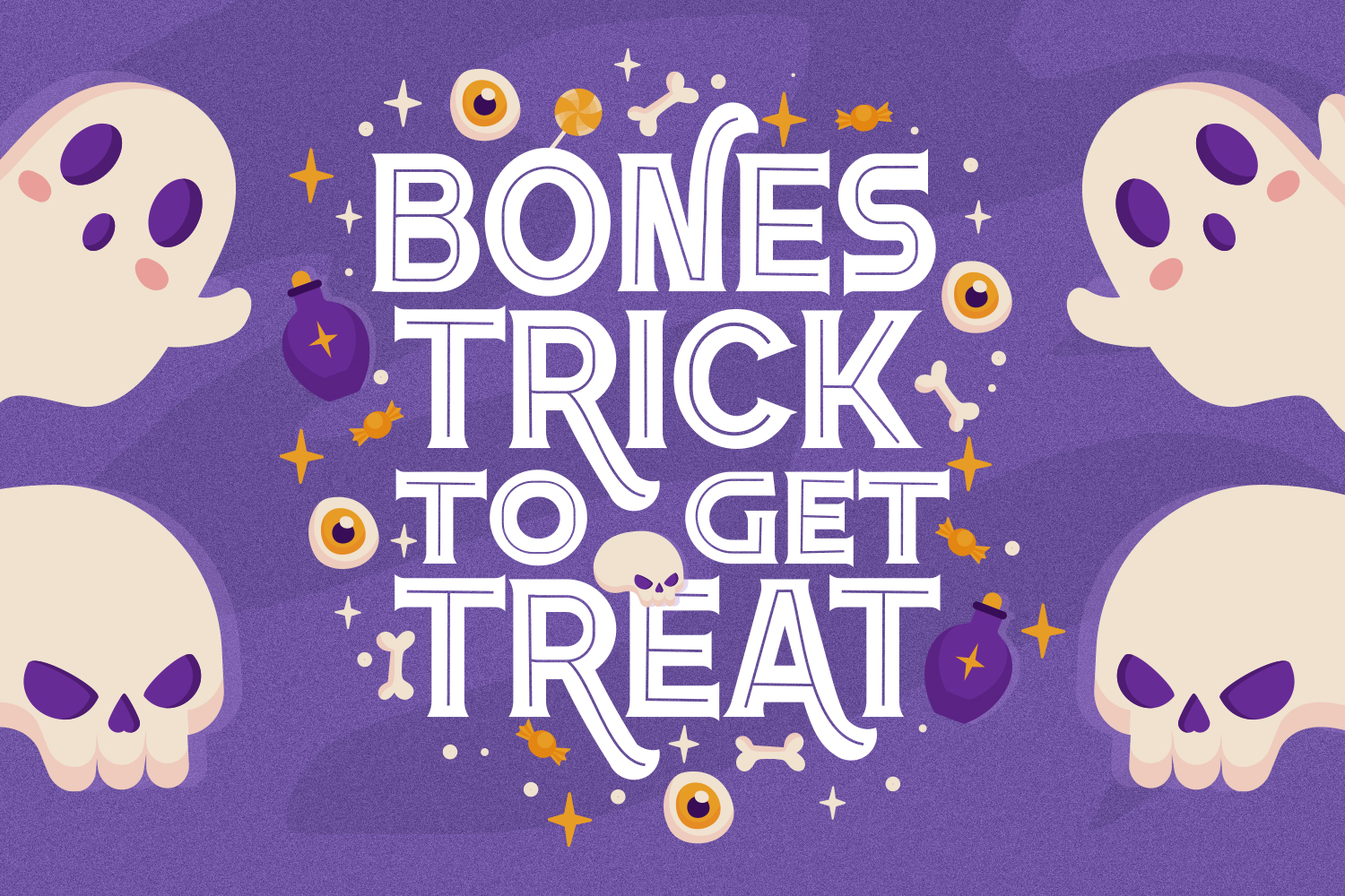
Embracing whimsical, uneven handwriting, this option delivers an eccentric, creepy crawly aesthetic. The variable letter heights and organic spacing resemble erratic journal entries or classic fairy tale curses, making it highly effective for greeting cards, novel chapter headers, and casual social media graphics. Choosing the Mokacinoy introduces a personalized, unpredictable human touch to seasonal creative layouts.
12. Railings
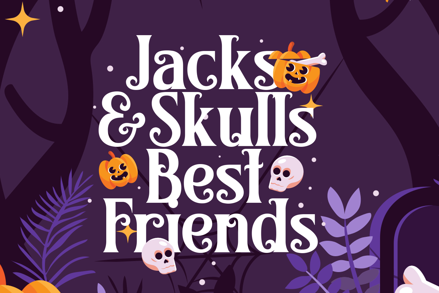
This selection features clean, structured geometric lines paired with sudden, unsettling curves and unexpected crossbar heights. The juxtaposition of industrial precision and strange proportions creates a distinct psychological discomfort, perfect for psychological thrillers, modern corporate tech events, or abstract poster art. The Railings offers a clean, modern take on seasonal atmospheric branding.
13. Tahucres
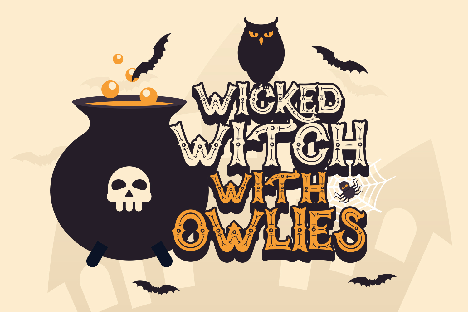
Defined by its incredibly sharp, claw like serif edges and high contrast stroke widths, this layout provides an aggressive yet pristine look. It bridges the gap between high end editorial elegance and sharp horror imagery, performing exceptionally well in modern editorial designs, premium web headers, and minimalist product boxes. Utilizing the Tahucres ensures that your layout remains elegant while carrying a dangerous seasonal bite.
Essential Tips for Pairing Spooky Fonts for Halloween
Creating a professional layout requires balancing highly expressive title elements with clean, neutral supporting text. When utilizing complex display assets for headers, always pair them with clean sans serif or simple geometric fonts for the body text to maintain optimal reading comprehension. Overloading a canvas with multiple decorative styles reduces visual hierarchy and confuses the viewer.
Adjusting technical layout properties also influences the overall atmospheric impact. Increasing the tracking (letter spacing) on sharp serif headers can enhance a sense of emptiness, isolation, or suspense. Conversely, tightening the kerning on heavy, textured brush variants creates a dense, claustrophobic visual weight. Always ensure high color contrast such as utilizing vivid neon orange, toxic green, or stark white text against deep matte black backgrounds to maximize text legibility across different mobile screens and print materials.
Executing these professional type pairing techniques ensures your marketing campaigns maintain structural hierarchy. Selecting high quality, legally compliant creative assets allows designers to build impactful seasonal content that engages audiences, preserves brand identity, and drives strong commercial conversions throughout the autumn season.
Elevate your seasonal marketing campaigns and creative design workflows by exploring the premium typography collections at Imoodev. Our extensive catalog offers professional creators access to high resolution web fonts, flexible desktop formatting, and comprehensive commercial licensing options tailored to protect your business. Secure the perfect visual assets today to ensure your corporate rebranding, commercial merchandise lines, and digital media projects stand out with flawless execution during the competitive autumn retail cycle.